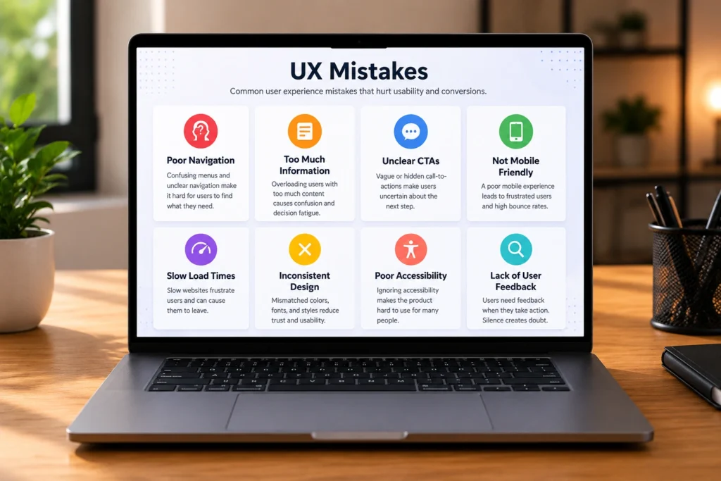
There’s a specific kind of pain that comes with a website that looks polished on the surface but quietly drives people away. You put real effort into the design. You thought through the layout. And still, the bounce rate is high, the contact form sits empty, and visitors leave faster than they arrive. Most of the time, the culprit isn’t the visual design at all. It’s the experience underneath it.
UX mistakes are sneaky precisely because they’re often invisible to the people who built the product. When you know where everything is, when you understand the logic behind every menu label, when you wrote the copy yourself, your own familiarity hides the friction from you. What feels obvious to you can be genuinely confusing to someone landing on your site for the first time with zero context and a short attention span.
The good news is that most of these problems are fixable. You don’t need a full rebuild. You need a clear-eyed look at where the experience is breaking down and what to do about it. This guide walks through the most common issues we see when auditing sites for businesses across law, healthcare, e-commerce, and service industries, and what to actually do about each one.
Skipping User Research Before Building
This one sits at the root of so many other problems. When a product is built on assumptions rather than real user data, identifying bad ux becomes much harder later because the errors are baked into the foundation itself.
The mistake usually sounds reasonable in the moment. The team knows the audience well. They’ve spoken to a few customers. They have a clear vision for how the product should work. So they skip the structured research phase and move straight to design. A few months later, they discover their users wanted something different entirely. The checkout flow they designed makes sense to an internal team member but confuses someone who’s never seen the product before.
The fix is less complicated than it sounds. Even basic user research, a handful of interviews with real potential users, a short survey, or a round of usability testing on a prototype, surfaces insights that no amount of internal brainstorming can produce. If you’ve already built and launched, it’s not too late. Hotjar session recordings and on-site surveys give you behavioral and qualitative data from your actual current users. That’s often more valuable than pre-launch research because the problems you’re seeing are real and live.
Poor Navigation and Information Architecture
Navigation is where most UX design mistakes show up first, and where they cause the most immediate damage. A visitor who can’t find what they need within the first few clicks doesn’t send you feedback about it. They simply leave.
Some of the patterns we see most often:
- Menu labels that make sense internally but mean nothing to an outside user
- Too many top-level navigation options competing for attention at once
- Important pages buried under multiple layers of nested menus
- No clear path guiding users toward the main conversion action
- Mobile navigation that’s an afterthought, with tiny tap targets and collapsed menus that don’t behave predictably
The fix is to test your navigation with people who aren’t familiar with your site. Watch where they get stuck. Simplify wherever you can. If your most important page takes more than two or three clicks to reach from the homepage, that’s a structural problem worth addressing before anything else.
Designing for Desktop and Forgetting Mobile
This one keeps showing up even in 2025, which is genuinely surprising given that mobile accounts for over 60% of global web traffic. A site that works beautifully on a 27-inch monitor and falls apart on a phone is, statistically speaking, broken for the majority of your visitors.
The most common version of this problem isn’t a complete lack of mobile design. It’s a mobile layout that was treated as a resized version of the desktop rather than designed as its own experience. Fonts that are technically readable but feel cramped. Buttons that are technically clickable but require precise tapping. Forms that require horizontal scrolling because the fields were sized for desktop input.
The fix is to design mobile-first, meaning you start with the smallest screen and scale up rather than the reverse. Test on real devices at various stages of the process, not just in a browser simulation. Things that look fine in a resized desktop window frequently behave differently on an actual phone with an actual thumb navigating it.
Unclear Calls to Action
A call to action that blends into the page or says something vague like “Submit” or “Click Here” is one of the most reliably costly UX mistakes a site can make. It sounds trivial. The impact usually isn’t.
Users scanning a page need to understand in a fraction of a second what happens when they click a button and why it benefits them to do it. A button labeled “Get My Free Consultation” communicates both things instantly. “Submit” communicates nothing. The same logic applies to every interactive element on your site. Error messages, form labels, confirmation copy, placeholder text. Each one is a tiny conversation with the user and each one either helps them move forward or creates a small moment of confusion.
The fix here is part writing and part layout. Buttons should use active, specific language. They should stand out visually from the surrounding content. And there should be one clear primary action on each page rather than three or four equally weighted options competing for the same attention.
Ignoring Accessibility
Identifying bad ux that stems from accessibility gaps is something many businesses postpone because they assume it only affects a small percentage of users. That assumption is wrong on two counts. First, roughly one in four adults in the United States has some form of disability, many of which affect how they use digital products. Second, the accessibility improvements that help those users, better color contrast, clear labels, logical keyboard navigation, descriptive alt text, tend to make the experience better for everyone.
Accessibility failures also have SEO consequences that most people don’t connect to the design. Screen readers and search engine crawlers process content similarly. A page that’s poorly structured for assistive technology is often poorly structured for indexing too.
The fix doesn’t require a complete overhaul. Start with a free tool like WAVE or Axe DevTools to get an immediate picture of where your pages stand against WCAG guidelines. Most sites have a handful of high-frequency violations that account for the majority of the accessibility gaps. Fix those first and you’ll cover a significant portion of the problem with relatively little effort.
Overloading the Interface With Too Much at Once
There’s a temptation, especially for businesses with a lot to offer, to put everything on the screen at once. Every service. Every credential. Every testimonial. Every feature. The logic is that more information gives users more reasons to stay. The reality is that too much information competing for attention makes it harder to find any of it and exhausting to try.
This is one of the UX mistakes that’s often hardest to get stakeholder buy-in to fix because it requires removing things, and people tend to be attached to what they’ve already put on a page. But cognitive overload is real and measurable. When users face too many options or too much content without clear hierarchy, their instinct is often to do nothing and leave rather than sort through it all.
The fix is ruthless prioritization. What is the single most important thing a visitor needs to understand on this page? What action do you most want them to take? Build the layout around those two answers and demote everything else. White space isn’t emptiness. It’s the visual breathing room that makes the important things visible.
Slow Page Load Times
A 2-second delay in page load time increases bounce rates by over 100%. Users who wait more than three seconds for a page to load typically don’t wait. They leave, and they’re less likely to come back. Page performance is not a backend concern separate from UX. It is a UX concern. A slow page is a bad experience regardless of how well-designed the layout is once it finally appears.
Common causes include uncompressed images, render-blocking scripts, excessive third-party plugins, and server configurations that haven’t been optimized. Google PageSpeed Insights and Lighthouse give you a free, specific breakdown of what’s slowing your site down and how to address each issue. Core Web Vitals, the metrics Google uses to assess page experience, are worth understanding and tracking because they affect both user experience and search rankings simultaneously.
No Feedback for User Actions
When a user submits a form, clicks a button, or completes a step in a flow, they need to know something happened. If the page just sits there after they click, most people assume it didn’t work and click again. Or they assume the site is broken and leave. This kind of silent failure is one of the UX mistakes that’s completely avoidable and often the result of a small development oversight rather than any deliberate design decision.
The fix is simple: every meaningful action should produce visible feedback. A loading indicator while something processes. A confirmation message when a form submits successfully. A clear error state with a helpful description when something goes wrong. Users shouldn’t have to guess whether their action worked. Tell them.
Let’s Fix Your Site’s UX Mistakes
If any of the issues in this list felt familiar while you were reading, that’s worth paying attention to. Recognizing the pattern is the first step. Knowing how to prioritize and fix it across a live site with real constraints is where it gets more complex.
At DesignFxPro, we work with businesses to identify and resolve UX mistakes that are costing them conversions, trust, and users. We combine behavior data, heuristic evaluation, and conversion analysis to produce a clear roadmap of what to fix and in what order.
Book a free consultation with DesignFxPro. We’ll look at your site honestly, tell you what we find, and walk you through a practical plan for improving it.