Most business owners know their website isn’t quite right. Maybe it loads slowly. Maybe it looks fine on a desktop but falls apart on a phone. Maybe people land on it and leave without doing anything, and nobody really knows why. The honest answer is usually that the site was built to look like a website rather than to function like one. And those two things are not the same.
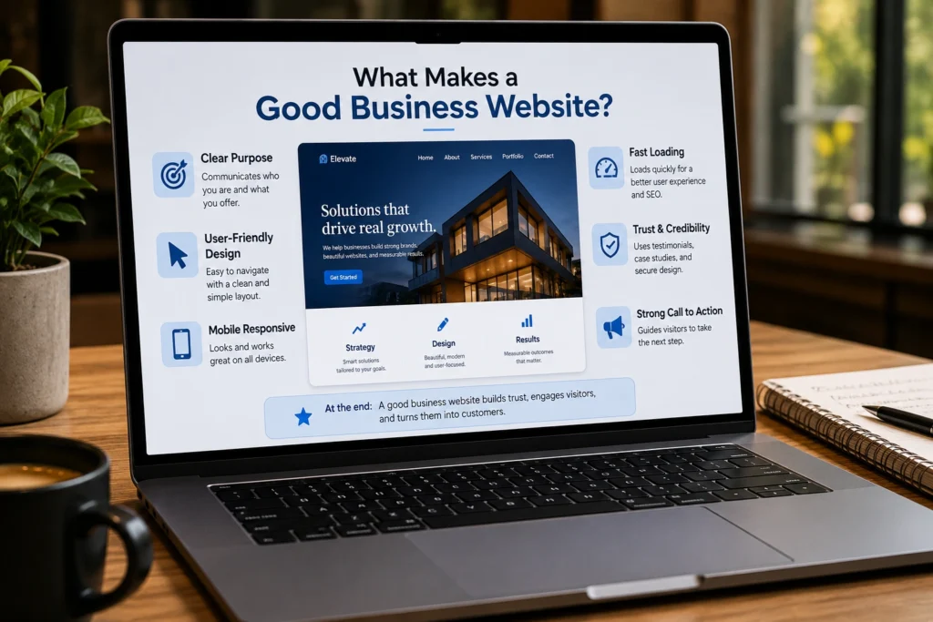
What makes a good business website isn’t a mystery, but it’s not just about design either. It’s about a specific combination of things working together: speed, clarity, trust signals, mobile experience, content, and conversion logic. When those pieces are aligned, a website does real work for your business around the clock. When they’re not, you’re paying to host something that actively costs you leads.
This guide covers the eight things that consistently separate high-performing business websites from the ones that just sit there looking decent. Whether you’re running a law firm, a healthcare practice, an e-commerce store, or a service-based startup, these fundamentals apply.
A Clear Message That Lands in the First Five Seconds
The moment someone arrives on your homepage, a clock starts. Research consistently shows that users form an impression of a website within about 50 milliseconds, and most decide within the first few seconds whether to stay or leave. If your homepage doesn’t immediately answer the three questions every visitor is silently asking, you lose them.
Those three questions are: What do you do? Who is it for? Why should I choose you over anyone else?
A homepage headline that says something like “Empowering businesses to reach their potential” answers none of those. One that says “Criminal Defense Attorneys in Phoenix, Available 24/7” answers all three. This isn’t about being clever. It’s about being clear faster than your visitor gets bored. Most professional website elements fail here not because the design is bad, but because the message is vague.
Fast Load Times That Don’t Test Anyone’s Patience
A delay of just one second can reduce conversions by 7%. That’s not a hypothetical. It’s documented across thousands of sites and consistently validated by Google’s own research. Page speed is a user experience issue, a conversion issue, and a search ranking issue all at once.
The culprits are usually the same: uncompressed images that are far larger than they need to be, too many third-party scripts loading on every page, cheap shared hosting that can’t handle moderate traffic, and themes or plugins that were never optimized for performance. Most of these are fixable without rebuilding the site from scratch.
Run your site through Google PageSpeed Insights and look at your Core Web Vitals scores. If your Largest Contentful Paint, the time it takes for the main content to appear, is over 2.5 seconds, that’s worth fixing before almost anything else. Visitors won’t wait. They’ve already seen the back button.
Mobile Experience That Actually Works
Mobile traffic accounts for over 60% of global website visits. If your mobile layout was designed as a compressed version of your desktop site rather than its own experience, you’re providing a frustrating experience to the majority of your visitors.
Effective website design for mobile means more than just a layout that resizes. It means tap targets that are easy to hit with a thumb, text that’s readable without zooming, navigation that makes sense in a smaller context, and forms that don’t require horizontal scrolling or excessive typing. Load times on mobile matter even more than on desktop because mobile connections are often slower.
Test your site on a real phone, not just a browser simulation. Hand it to someone who isn’t familiar with your business and watch them try to find your contact page or your main service. If they struggle, your mobile experience needs work.
Navigation That Gets People Where They Need to Go
Navigation is one of those things that nobody notices when it works and everybody notices when it doesn’t. A visitor who can’t find what they came for doesn’t submit a support ticket. They leave, and they probably don’t come back.
Good navigation follows a few consistent website best practices:
- Menu labels should use plain language that matches how your users think, not how your internal team describes things
- The most important pages should be reachable within two clicks from the homepage
- Every page should have a clear next step, either deeper into the content or toward a conversion action
- Mobile navigation should be tested separately and not just assumed to work because the desktop version does
Information architecture, how your pages are organized and grouped, matters as much as the menu itself. If your most valuable service is buried under three layers of navigation, the best copy in the world won’t save it.
Trust Signals That Earn Confidence Before the First Call
People don’t hand over their email address, phone number, or credit card details to a site they don’t trust. Trust on a website is built through specific, visible signals, and most small business websites dramatically underinvest in them.
The most effective trust signals include:
- Client testimonials and reviews with real names, not generic quotes attributed to “satisfied customer”
- Case studies or results that show specifically what you’ve done for people like the visitor
- Professional photography of your team, your space, or your work. Stock photos of handshakes erode trust rather than building it.
- Credentials, certifications, and association memberships displayed where visitors naturally look for them
- A clear privacy policy and security badge on any page that asks for personal information
For law firms and healthcare practices in particular, this matters enormously. People are choosing someone to trust with sensitive situations. Every unpolished or unverified element on your site is a small reason to click away.
Calls to Action That Tell People What to Do Next
This is one of the most reliably underestimated business website features. A call to action that blends into the page, or uses vague language like “Learn More” or “Submit,” is doing almost nothing. A call to action that’s specific, visible, and tells the user exactly what happens next converts.
“Get a Free 30-Minute Consultation” converts better than “Contact Us.” “See Pricing” converts better than “Learn More.” “Book Your Free Strategy Call” converts better than “Get in Touch.” The difference isn’t just wording. It’s that the specific version reduces uncertainty. The user knows what they’re signing up for.
Every page on your site should have one clear primary action. Not three equally weighted options competing for the same attention. One. The supporting content explains why it’s worth taking that action, and the call to action button makes it frictionless to do so.
Content That Answers Real Questions
What makes a good business website in the eyes of both visitors and search engines often comes down to the quality and relevance of the content. Pages that are thin, generic, or clearly written to fill space don’t rank well and don’t convert. Pages that directly address the questions your potential clients are actually searching for do both.
This doesn’t mean you need to publish daily. Consistent, well-researched content that genuinely helps your audience tends to outperform high-volume content that says nothing meaningful. A law firm publishing one detailed article per month answering a specific legal question their potential clients are searching for will typically see better organic results than a firm publishing four generic posts a week.
Small business website tips that consistently hold up: write for your actual audience first, write for search engines second, and never write just to have something on the page.
SEO Foundations That Make the Site Findable
A website that can’t be found is a website that isn’t working. Search engine optimization doesn’t have to be complicated at the foundational level, but it does have to be done. A few specific things that matter most for most business sites:
- Individual pages for each practice area or service, not one catch-all page that mentions everything
- Page titles and meta descriptions that include the terms people actually search for
- A Google Business Profile that’s fully built out and actively maintained
- Internal linking that helps both users and search engines understand how your content is organized
- Image alt text and proper heading structure throughout
Beyond the basics, local SEO is where most service businesses and professional practices have the most immediate opportunity. If you’re a personal injury firm in Dallas, appearing in the local map pack when someone searches that term is worth more than almost any other single marketing investment.
What Makes a Good Business Website, Summarized
Each of the eight things above is a lever. Pull one and you see some improvement. Pull all of them together and the site becomes a genuinely effective business tool rather than a digital placeholder. A good business website works because all its key elements come together, not because of one feature alone.
Speed earns the right to a first impression. A clear message converts that impression into interest. Trust signals move interest toward intent. Strong calls to action convert intent into contact. Content and SEO make sure the right people find you in the first place. Navigation and mobile experience ensure they don’t get frustrated before they get there.
Your Website Should Be Working Harder Than It Is
If reading through this felt uncomfortably familiar, that’s worth paying attention to. Most business websites underperform not because they’re terrible but because they’re missing two or three of these fundamentals in ways that quietly cost leads every day.
At DesignFxPro, we build and redesign websites for businesses that are serious about what their site actually produces. We look at your current setup, identify the gaps, and build something that covers the things what makes a good business website actually requires.
Book a free consultation with DesignFxPro. We’ll give you an honest look at where your site stands and a clear picture of what it could be doing better.